MINNEAPOLIS, MN •
MINNEAPOLIS, MN •
Cliché
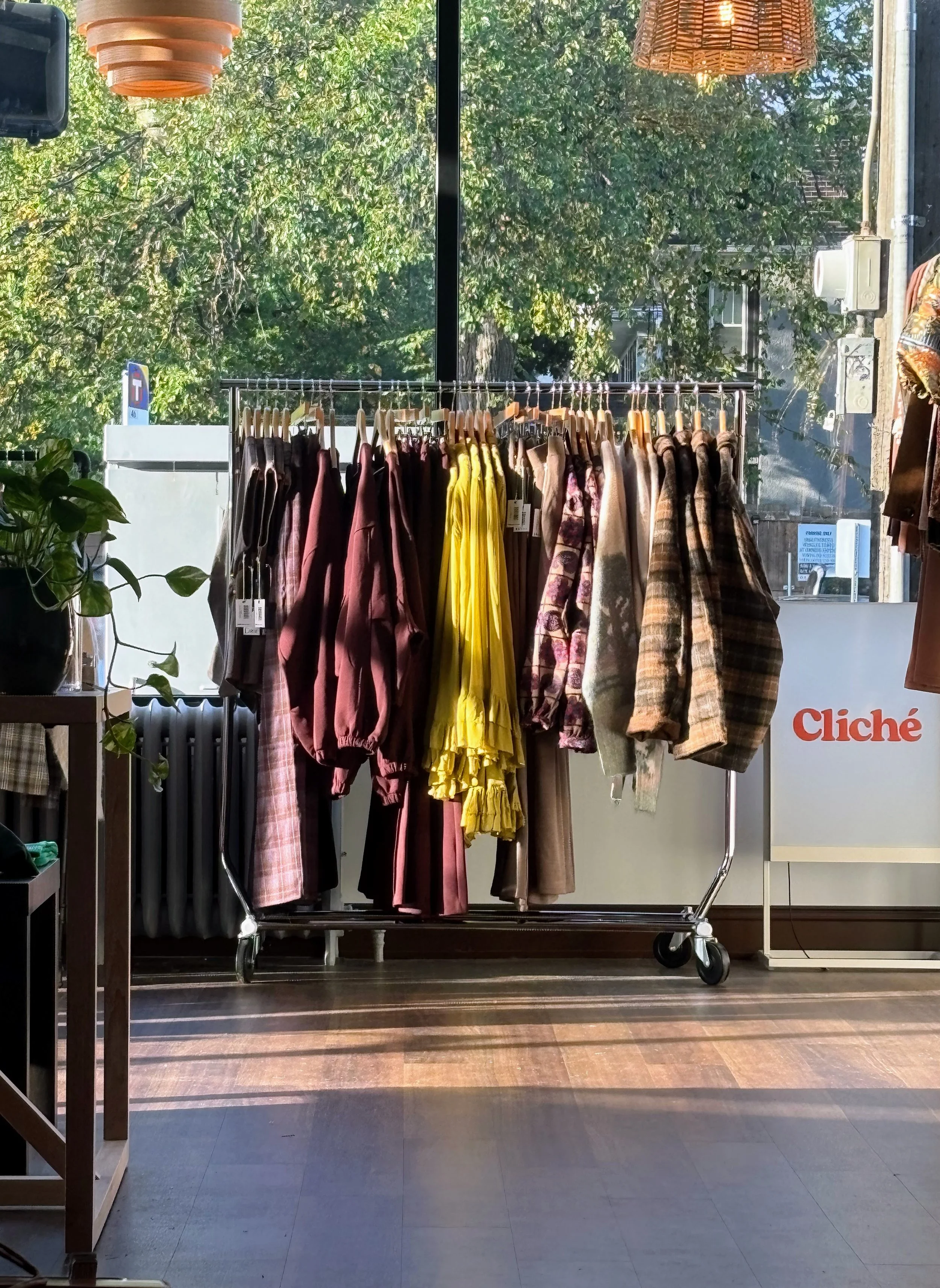
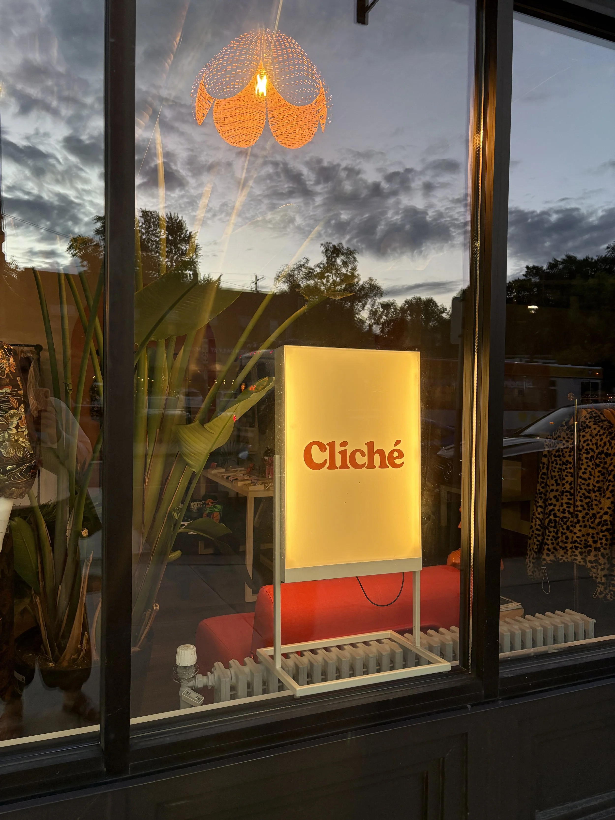
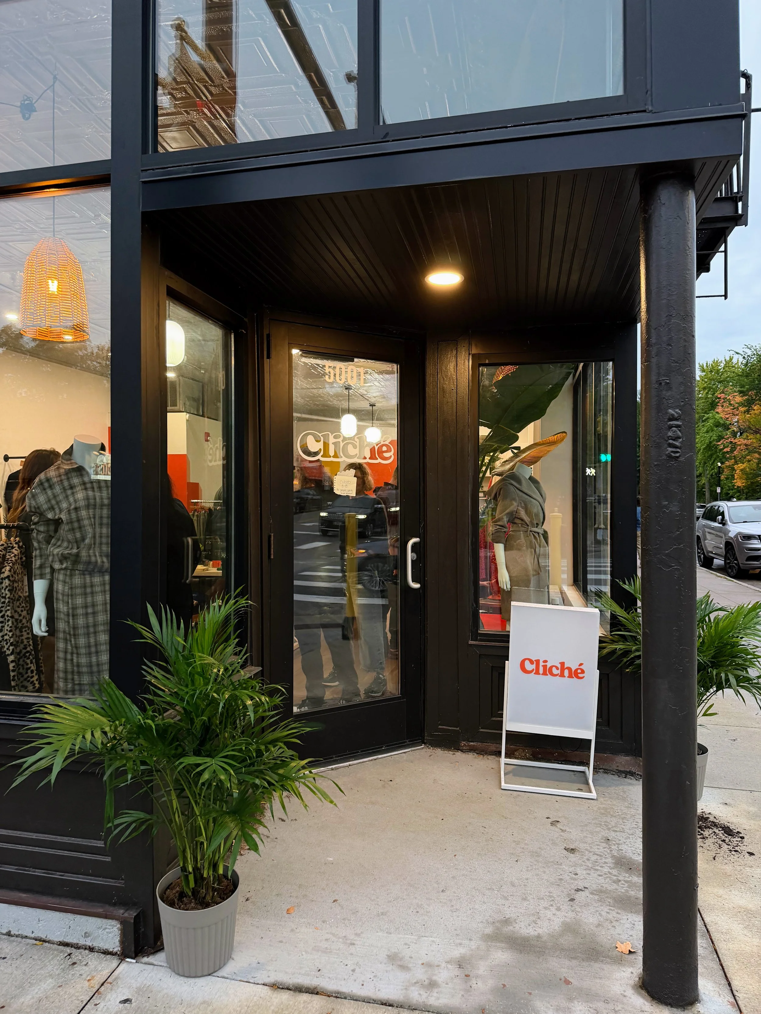
Formerly praised by Rolling Stone, Spin, Bust, and Oprah Magazine—not to mention a wall of local "Best Of" plaques—South Minneapolis's favorite retail haunt has officially unlocked the doors, dusted off the racks, and returned with a sharper, fresher edge.
Style Guide
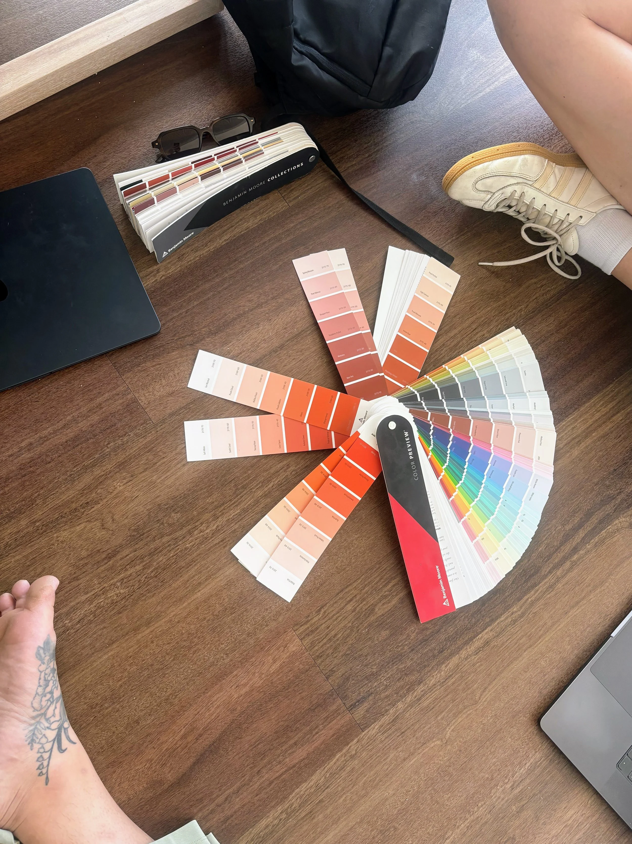
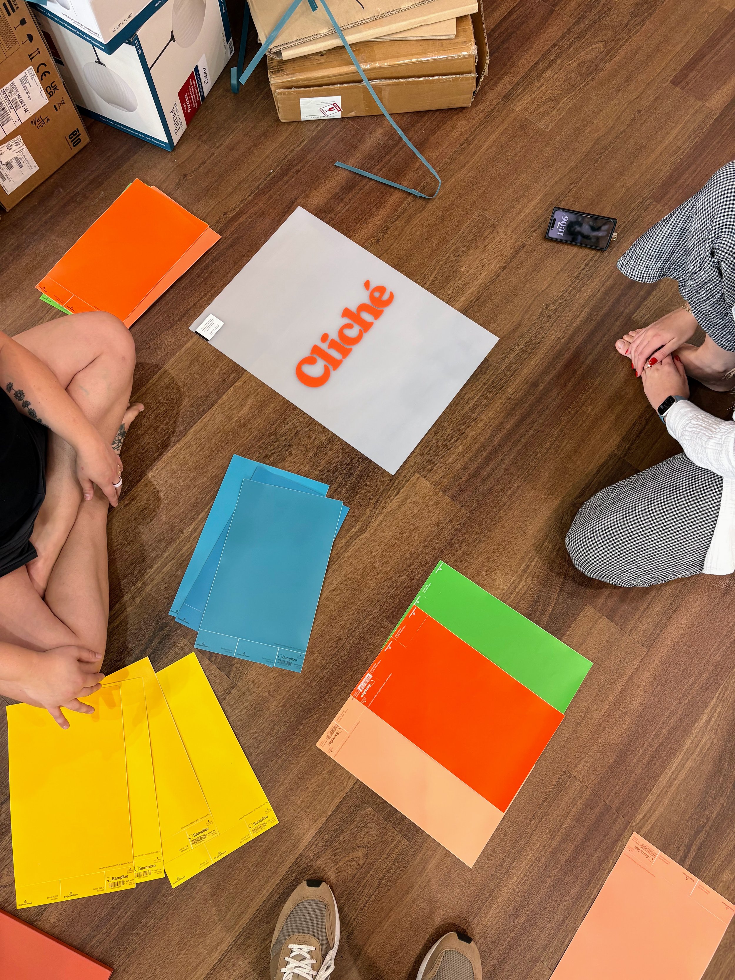
Color palette
#da5325
FESTIVE ORANGE
#609f47
SULLIVAN GREEN
SALZBURG BLUE
#228991
LEMON
#fcb714
PEACH COBBLER
#f2a287
#735742
KONA
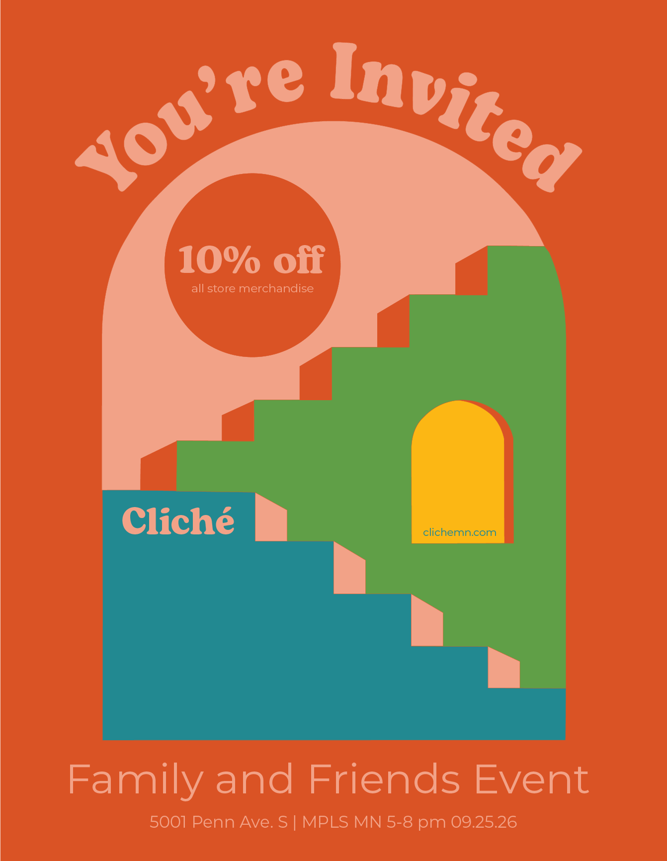
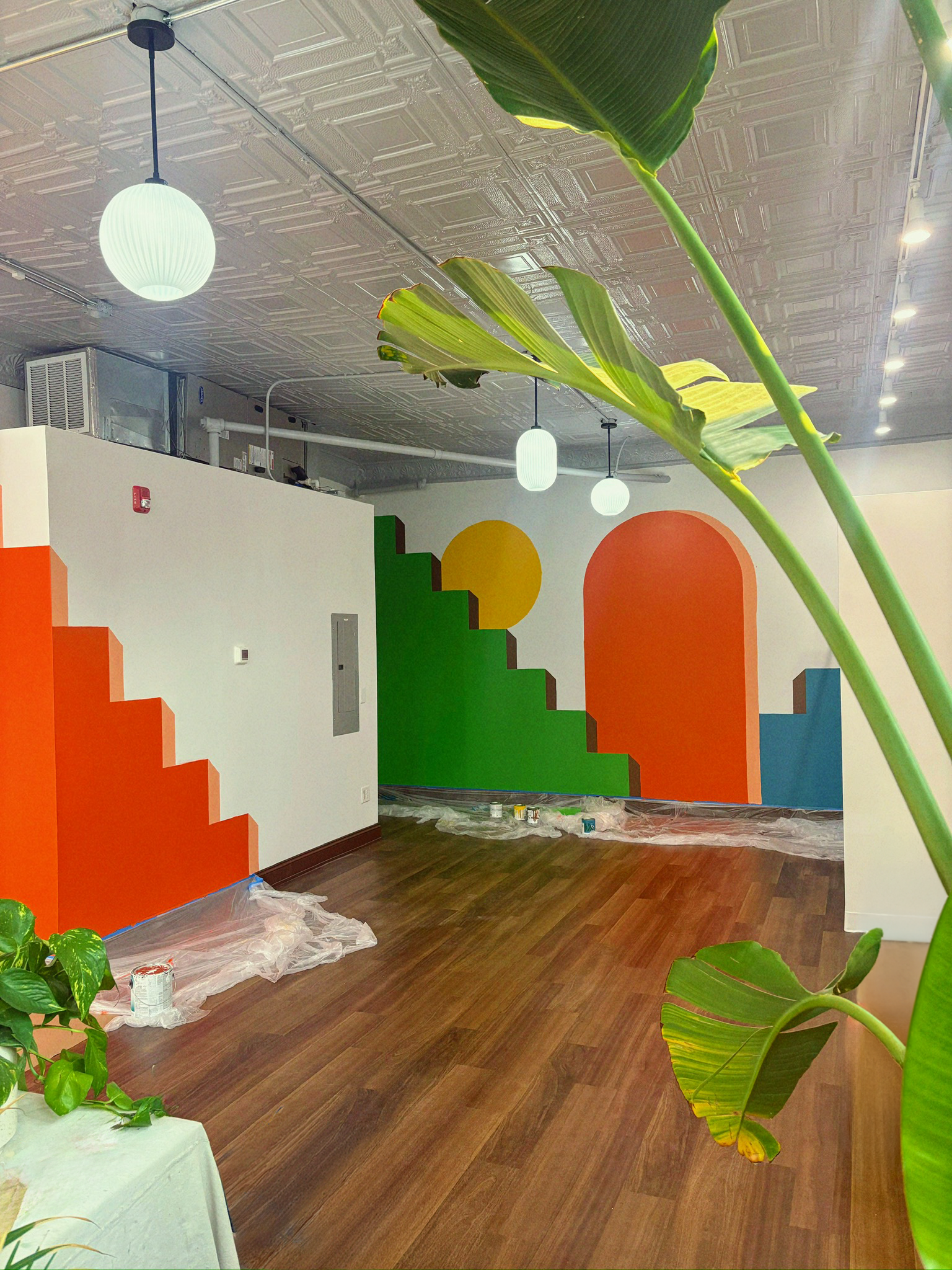
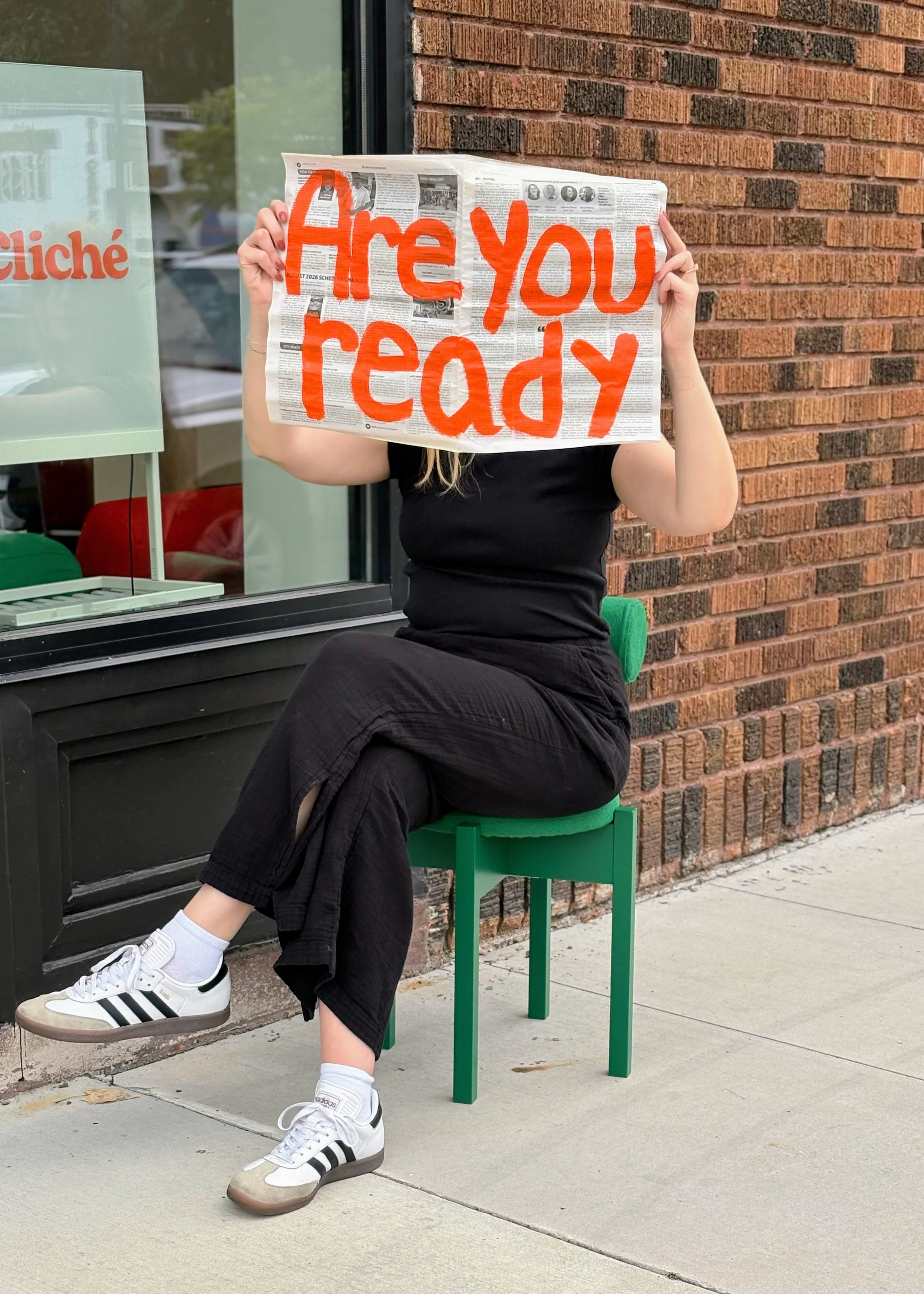
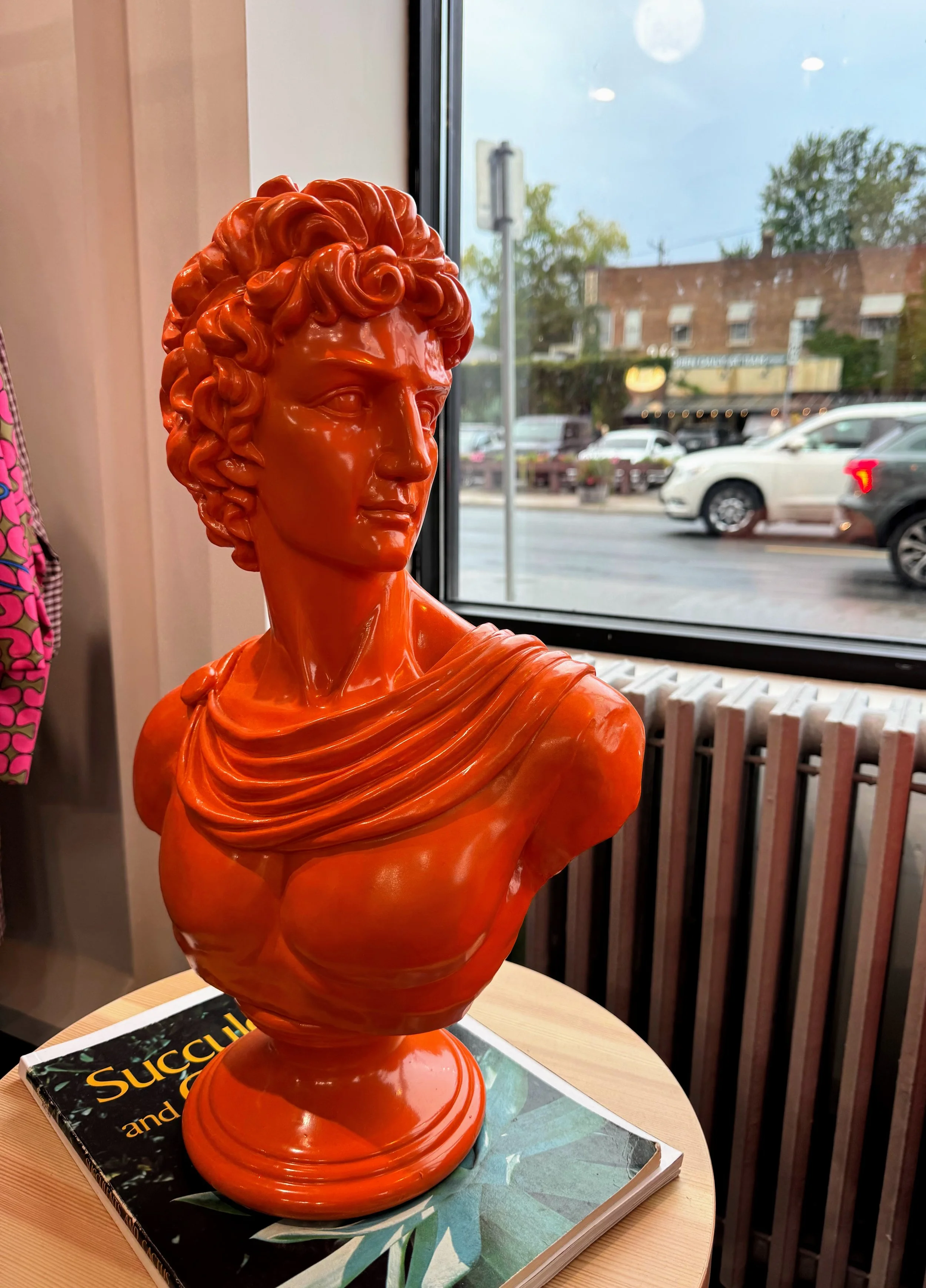
A love letter to vintage eclecticism, blending high-energy nostalgia with grounded, earthy warmth to balance retro charm and modern retail edge.
a store that cultivates community, self expression, and belonging.
Type standards and logo
Cutting the corporate fluff for a tight, cohesive aesthetic tailored to an audience that already knows what is good.
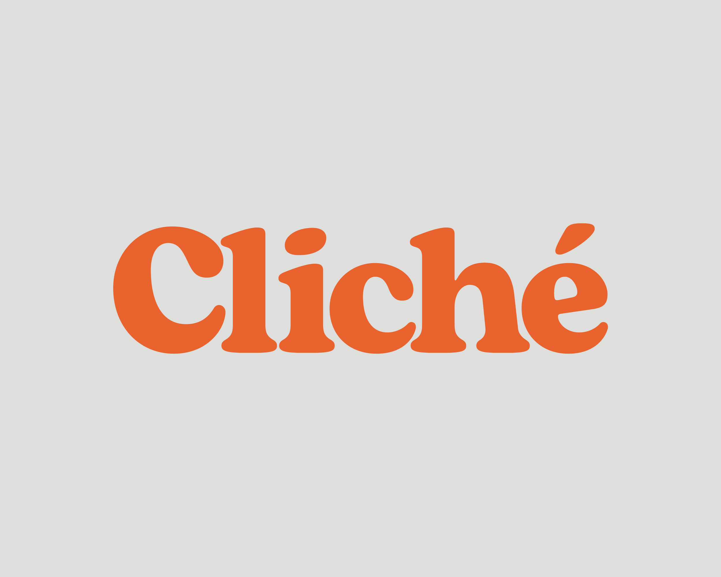
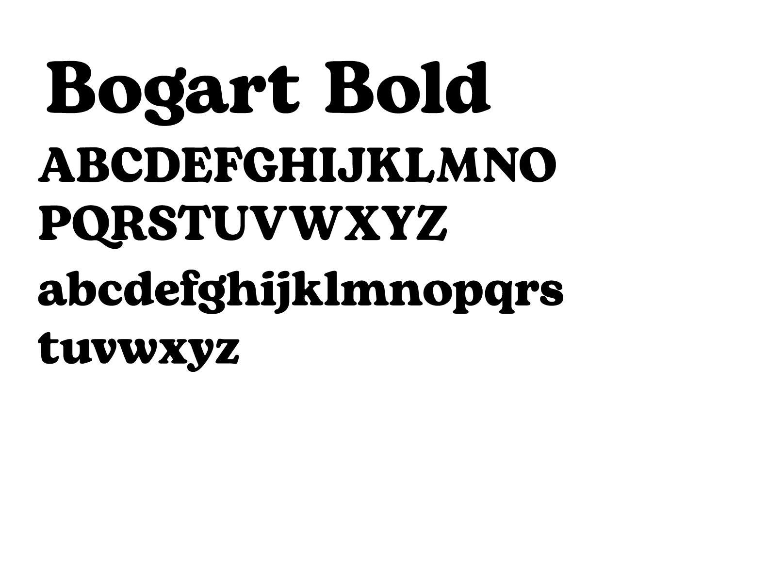
Primary
We leaned hard into the chunky, retro-groovy curves of Bogart. It gives the headlines an undeniable, personality-heavy punch that is warm, wavy, and instantly iconic.
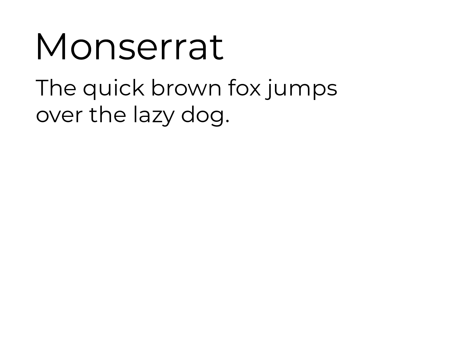
Secondary
To keep the heavy display type from entirely taking over the room, Monserrat steps in for clean, modern secondary text. It brings the geometric structure without ever stealing the spotlight.
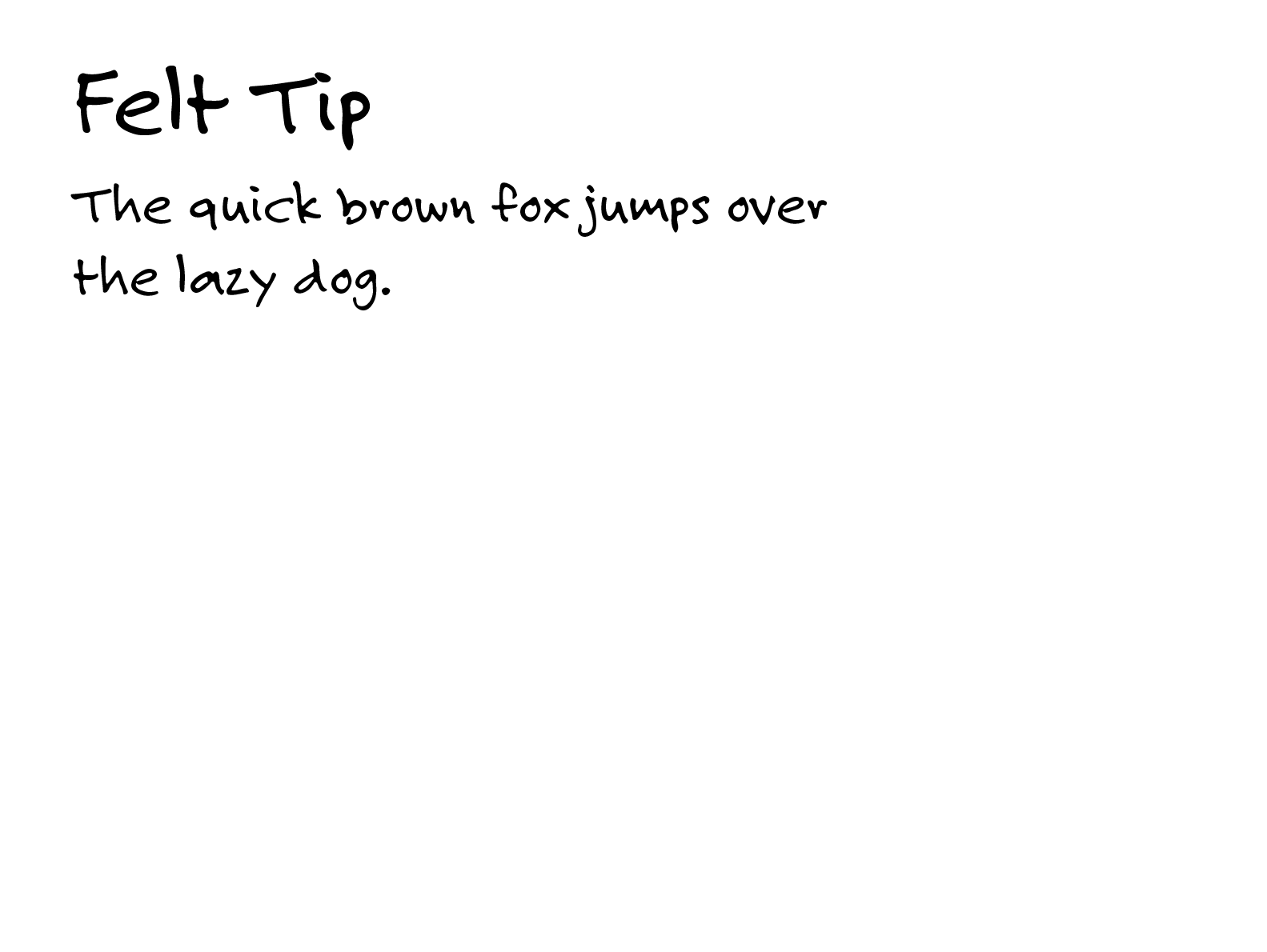
Tertiary
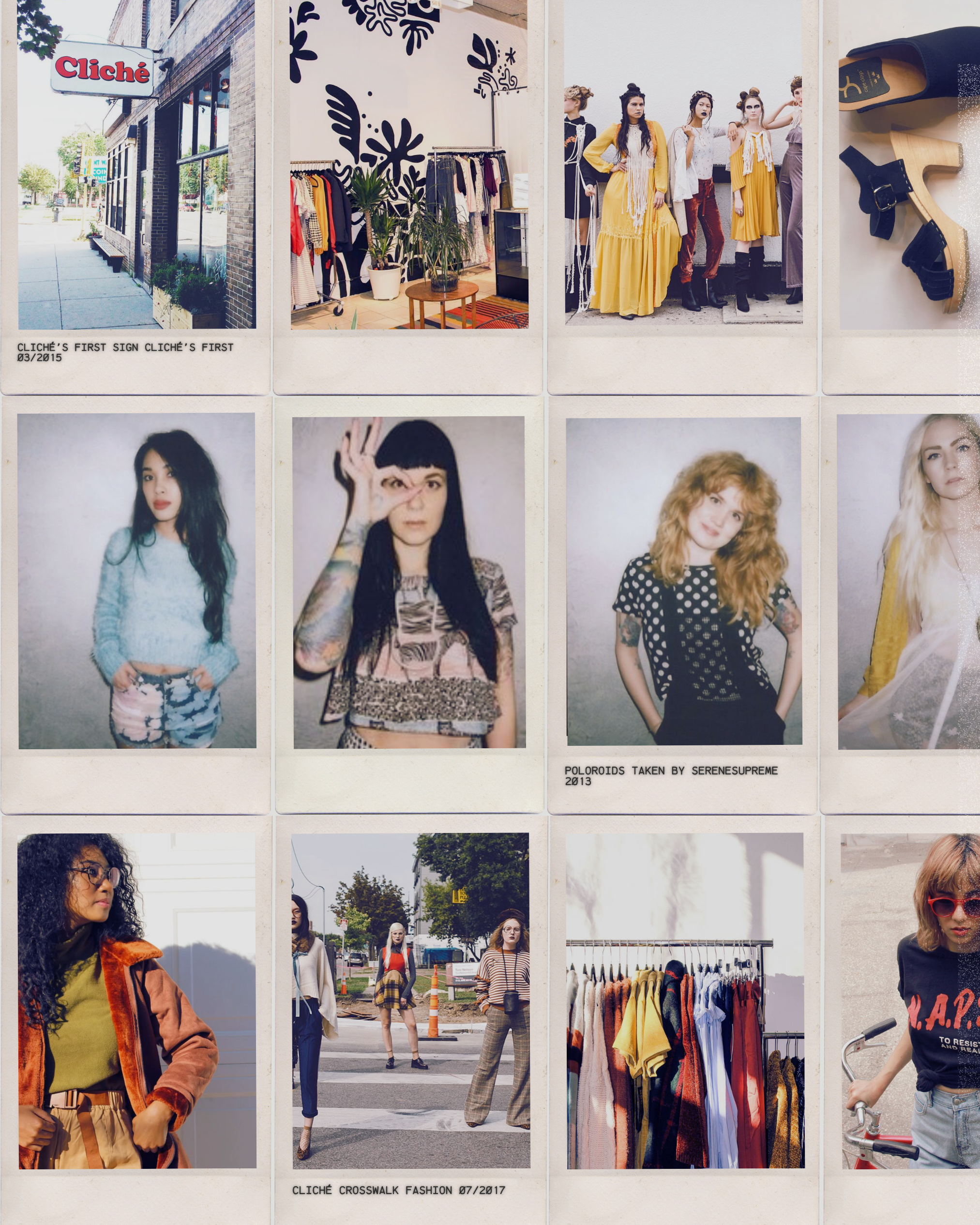
Keeping handwriting fonts strictly off-duty except for tiny, organic touches—like scribbled notes under polaroids—so the whole brand feels human, approachable, and lived-in.
Type-Driven Nostalgia
The typography itself acts as an homage to the boutique's roots, blending bold, retro-leaning headlines with effortless readability to anchor the modern era of Cliché.